The Case Against a Human Face
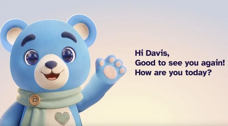
When Anna Oh, Head of Product & Design at Norbert Health, first imagined her care robot, she wasn’t really aiming for a face. She pictured something sleek and subtle—the kind of clean, abstract shape many designers dream of signing off on. But after months of chatting with residents in their 80s, 90s, and 100s, she landed on something much cozier: a 3D teddy bear.
© Norbert Health
I really enjoyed hearing her share this on the Healthcare UX podcast, but one detail caught my attention: Anna never actually showed a human face to any of the residents.
“We haven’t tested a real human face,” she explained. “Even before we tried any images, I talked with our residents, and they asked: What skin tone should it have? What gender? Should it look 20 or 40? What would it wear—would it be a nurse? There are so many details people notice, and they can quickly feel uneasy. An animal or an abstract avatar—something that isn’t human—actually helps them feel more relaxed about having the robot in their space.”
One resident put it simply, wondering about privacy: “What if I’m changing clothes and there’s a human face? I’m not sure.”
There’s also a practical reason behind this choice. Norbert isn’t a doctor or a nurse; it’s a helpful assistant for real staff, and Anna wanted that to be clear. A human face might make residents treat the robot like a caregiver or someone with medical authority—exactly the mix-up her team wanted to avoid.
What I’ve Noticed Elsewhere
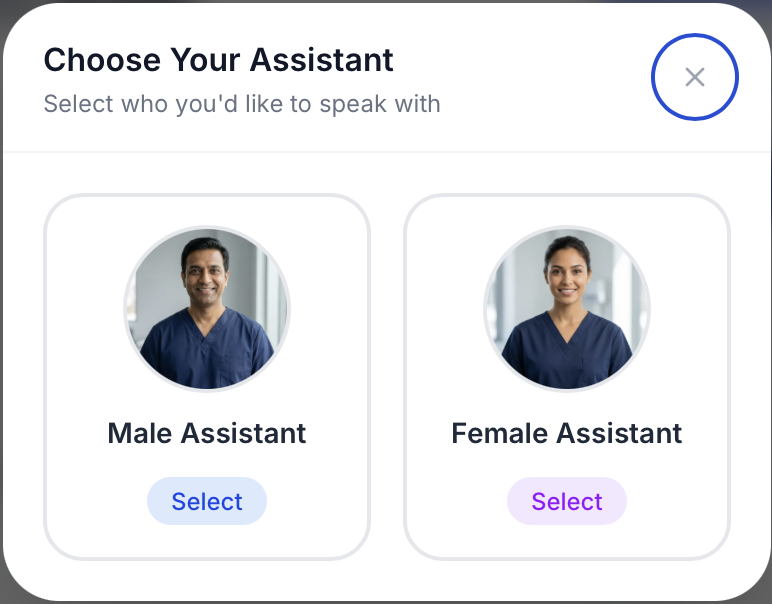
I’ve noticed a few AI health apps that give their assistants a human face. Most don’t let you choose—you just get assigned a companion. The rare ones that do offer choices usually don’t reflect the full diversity of users, which creates a subtle issue: a menu of “humanness” that doesn’t quite include everyone.
Honestly, my own preference leans toward Anna’s original design concept: something sleek and abstract—more about motion, light, and form than a face. It would clearly feel like technology rather than a person or pet. I watch a lot of sci-fi, so I bet that’s why. A glowing, moving shape feels like AI to me because that’s what movies and TV have taught me to expect.
But Anna’s research helped me realize that I can’t design for myself. If I were building this, I’d need to listen to users just like she did. I keep wondering if my sleek idea is more about being Gen X than a solid design rule. I grew up with sci-fi that made a blue glow feel like a character. Anna’s residents grew up giving stuffed animals to grandkids and rooting for a teddy bear mascot. I’m not sure if the teddy bear thing is about age—maybe we all soften toward comfort objects as we get older—or if it’s generational, and whether Gen Xers and Millennials will want something closer to my sci-fi vibe when we’re in that nursing home. Anna thinks it’s generational, but neither of us knows for sure. Only time and a few more decades of research will tell.
I totally get why many people prefer the opposite of what Anna created. Platforms like Smit Doshi’s My Happy Health intentionally use a human face, and that makes sense—it feels familiar and and distinctly human, like being greeted by a person instead of a gadget. That’s a legitimate design bet, and for a lot of users it probably works. In the case of My Happy Health, users are people who don’t readily have access to healthcare providers and may never have seen a doctor. So, the human face may also feel more serious and authoritative.
© My Happy Health
Still, I think Anna’s team had a good reason to steer clear. A human face doesn’t just bring warmth; it can make people assume there’s a real clinician on the other side. When that’s not the case, the mismatch between what the face suggests and what the app can actually do might break trust.
—
Listen to the Healthcare UX podcast with Anna Oh.
Listen to the Healthcare UX podcast with Smit Doshi.