
Genura™
A mobile app designed to support people through the hardest, most disorienting weeks of knee replacement recovery.
Role: Solo UX designer — research, IA, interaction design, visual system, prototype
Tools: Figma, Tokens Studio
Type: Self-directed portfolio project
Watch the demo reel
The ProblemRecovery from a knee replacement is months of work, and almost all of it happens at home, alone. The surgery is over in an afternoon; the hard part — swelling, sleep disruption, the daily grind of range-of-motion progress — plays out over weeks, largely unsupervised.
That leaves patients holding a question they have a hard time answering on their own: Am I actually getting better? Recovery is rarely linear, so a bad day feels like a setback even when it isn't. And by the time a patient reaches their next follow-up — often weeks apart — the day-to-day detail that would help their surgeon interpret their progress is simply gone. Nobody remembers what week two felt like by week six.
The audience here is narrower than "patients." It's people in the specific, temporary, high-anxiety window of post-operative orthopedic recovery — and, secondarily, the surgeons who see them only at intervals and have to reconstruct the weeks in between from memory.
The ApproachI designed Genura™ around a single idea: reduce the cognitive and emotional load of recovery; don't add to it. Every decision in the app, from the number of menu items to the words used in a warning banner, was filtered through that goal.
The app is built around the surgery date as its anchor. Patients can set it up before surgery, while they still have the bandwidth to learn a new tool, so it's already familiar by the time they're recovering and have far less capacity to spare. Past or future surgery dates are both supported, since not everyone downloads the app in advance.
I also designed for a specific failure mode I saw in every competing product: people set an app up once and never open it again. So the content is built to reward return visits, not just onboarding, through daily tips, a milestone system, and a check-in that takes no more than 30 seconds.
Process & ResearchI designed Genura™ as a two-mode (light/dark) interactive prototype in Figma, built on a full color-token system so the visual language stayed consistent and adjustable across every screen. The core of the app is a daily check-in built from three deliberately low-effort inputs — a pain slider, a sleep stepper, and a "how are you feeling" selector — plus a Progress view and a day-by-day recovery log.
I then tested the prototype with 5 people, three of whom had been through orthopedic recovery. I wasn't testing whether people could use it. The interactions are simple by design. I was testing the one thing that actually determines whether a recovery app is worth building: would someone three days or two weeks post-op actually keep this up? Adherence, not comprehension, was the research question. An app that captures a perfect recovery record nobody fills in is worthless.
Key Usability FindingsThe most useful thing testing surfaced wasn't about a single screen; it was about structure.
Testers opened the app unsure where to begin or what the day's task even was.
Logging felt like a separate destination: a chore they could, and would, skip.
People treated the Log screen as homework to complete, rather than a record they'd revisit.
Whichever it was, the takeaway was the same: my original information architecture was quietly working against the app's entire purpose. If the check-in isn't the obvious, frictionless center of the experience, it doesn't happen. And, if it doesn't happen, there's no record, no trend, and no answer to "how's recovery going?"
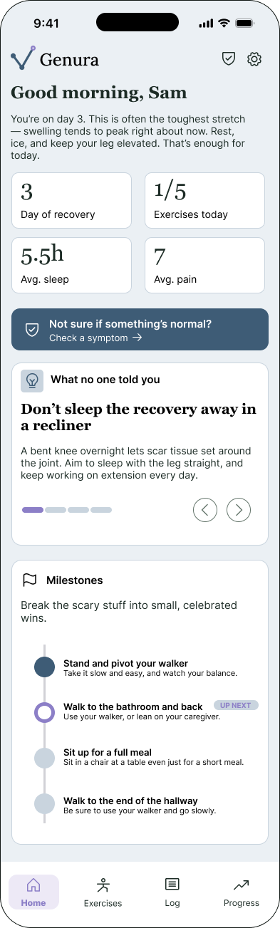
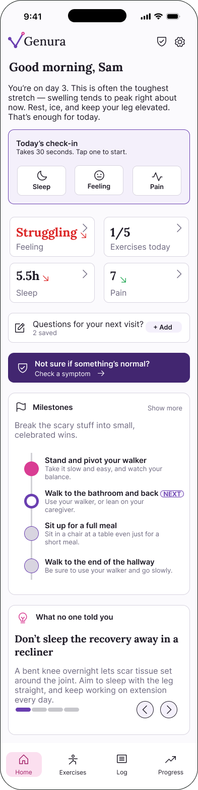
Images: original Home Screen in slate blue on the left (top on mobile), new Home Screen in lavender and fuchsia on the right (bottom on mobile).
Solutions Implemented
I brought the daily check-in onto the Home screen. The day's one action is now the first thing a patient sees. No hunting, no navigating to a separate destination to do the thing the whole app exists for.
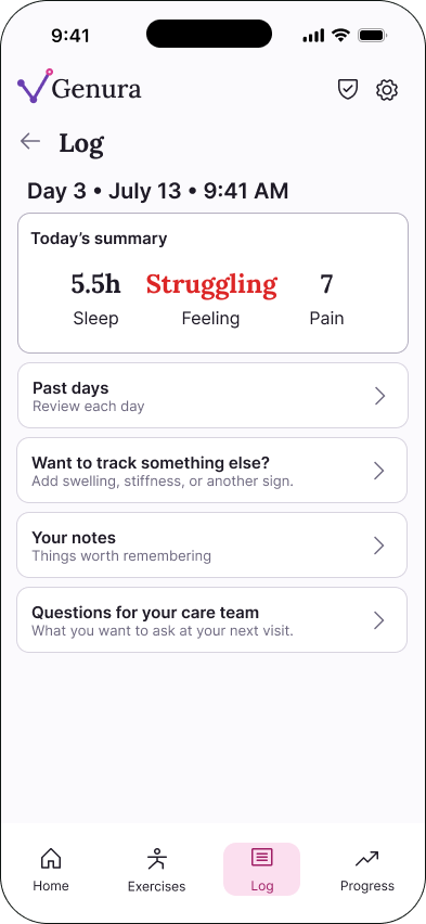
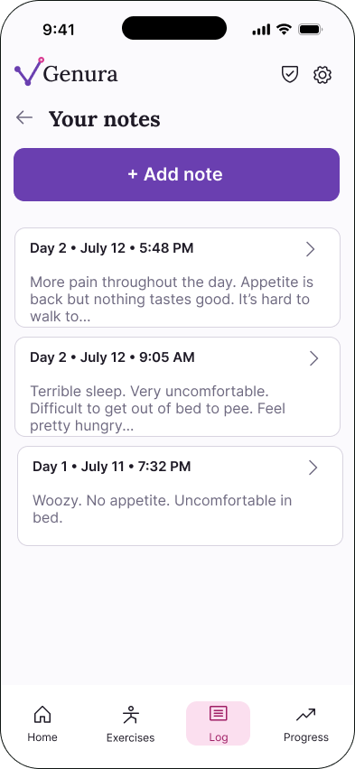
I reframed the Log from a place you go to do work into a record you read. Instead of a data-entry destination, the Log became a captain's log of recovery — an indexed, day-by-day account the patient can scroll back through, and bring to their surgeon at their follow-up. In short: doing and reviewing became two different jobs instead of one confusing one. Check-in is for capturing today; the log holds the detail.
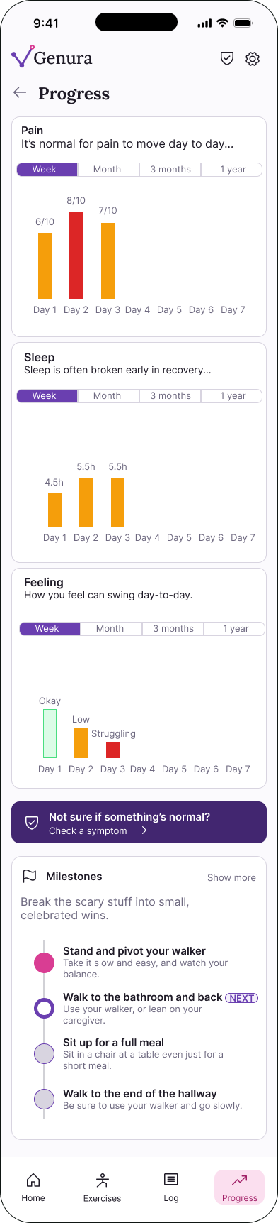
The Progress screen became the visual snapshot of recovery over time — the at-a-glance view a patient actually hands to their surgeon, because a ten-minute follow-up needs a trend, not a scroll through thirty days of entries.
Around those two decisions, the supporting design:
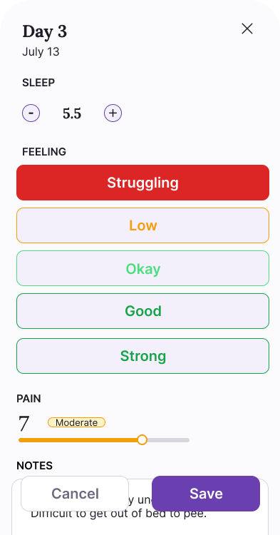
A ~30-second daily check-in built from three inputs — pain slider, sleep stepper, feeling selector — because effort is the enemy of adherence, and a form is the fastest way to lose someone in week two.
A refined feeling scale (amber = struggling, yellow = low, greener tones for okay/good/strong) so the day's emotional read is legible without feeling like a grade.
Notes and questions flows with privacy-preserving defaults, so patients can capture things to raise with their surgeon without that content leaving the device.
A Progress view and a day-history screen with inline metrics, turning individual check-ins into a trend the patient can watch improving — and, critically, the snapshot they bring to their surgeon so the appointment starts from data instead of memory.
A deliberate day-numbering convention: surgery day is unnumbered; Day 1 is post-op day 1 (POD 1). A small detail that signals the app understands the clinical mental model, not just the interface.
Designing Within ConstraintsDesigning for a post-surgical, regulated context means much of the work is deciding what not to build — or how tightly to constrain what you do. Three decisions drew the edges of this version, and together they say more about the design thinking than any single screen.
Deferred care-team sharing. The obvious next feature is letting patients send their recovery record to their surgeon's office. I deferred it deliberately. Provider sharing reintroduces exactly the HIPAA and compliance surface the local-first architecture was chosen to avoid, and the version worth shipping needs more design maturity than a first prototype can carry. Better to defer the real feature than ship a risky stub.
Restraint here was a design tool rather than a limitation: each decision kept the product on the safe side of a regulated line while the design matured.
Results & ImpactGenura™ is an interactive Figma-based prototype with a proof-of-concept build, not a deployed product, so I'm reporting what's honestly measurable, not deployment metrics I don't have.
Design outcomes. The IA restructure resolved the core tension testing surfaced: the check-in is now the unmissable center of the experience, and the log finally does the job it's named for: a record you read, not a chore you skip. Separating doing from reviewing gave the app a coherent spine that the earlier layout lacked. In follow-up testing, all participants located and completed the daily check-in without any guidance — the specific behavior the IA change was meant to produce.
A regulatory decision as a real outcome. Choosing a local-first architecture wasn't a limitation I backed into; it was a scoping decision that would let a solo designer ship something trustworthy and defensible without pretending to solve enterprise-grade health-data compliance. Knowing what not to build yet is part of the design.
What I'd measure next. If Genura™ went to a real post-op cohort, the metrics that would tell me whether the design worked are: daily check-in completion rate over the first two weeks (the true adherence test), time-to-first-check-in after opening the app, how often patients return to the captain's log, and — the one that matters most clinically — whether patients actually bring the Progress snapshot to their follow-up appointment. Those are the numbers this design is built to move.
ReflectionGenura™ started as an interaction-design exercise and became a lesson in listening to what testing actually said, not what I hoped it would say. The most valuable change wasn't a prettier component; it was a structural one that made the app quieter, clearer, and more likely to be used on the days recovery is hardest. That, more than any single screen, is what I'd want an app like this to be judged on.