
Grocery Delivery App
Project title: The Last Mile: Designing a Senior Grocery Delivery System for Houston's Third Ward
Intro: This is a concept project completed as part of a UX design course at Interaction Design Foundation (IxDF) called Design for the 21st Century with Don Norman. Working through the full design thinking process — research, personas, journey mapping, task flows, and wireframing — I explored how H-E-B, Houston's beloved grocery chain, could partner with Third Ward churches to offer free grocery delivery to elderly residents who can no longer get to the store on their own.
Solo project · UX design course · May 2026 · Tools: Keynote, Figma, Claude (research and ideation)
Overview
Houston's Third Ward is one of the city's most food-insecure neighborhoods, and its elderly residents face a specific, compounding problem: even when food is technically nearby, getting there and carrying it home is physically out of reach. This project explores how H-E-B, in partnership with Third Ward churches, could offer free Saturday morning grocery delivery to seniors — using volunteer drivers from the congregation and a simple mobile ordering app designed for older phones and arthritic hands.
The work follows a full UX design process: neighborhood research, three user personas, a journey map, task flows, and six wireframe screens. The central design insight was that this system has more than one user. Dorothy, 68, places the order. DeShawn, 42, drives the delivery. And Keisha, Dorothy's daughter living an hour away, quietly anchors the whole thing — setting up the account, receiving confirmations, exhaling when the delivery is done.
This is a concept project built on secondary research, not live user interviews. Everything here is a hypothesis. The next step would be sitting across from actual Third Ward seniors and finding out how much of it holds.
The Problem
For elderly residents of Houston's Third Ward, food insecurity isn't just about income — it's about not being able to get to the store, or carry groceries home when they get there.
The Third Ward is one of Houston's most food-insecure neighborhoods, with residents experiencing food insecurity at a rate 125% above the national average. Its only full-service grocery store, the H-E-B MacGregor Market, opened in 2019 — the first in the area in 20 years. But for seniors without a car, a bus ride to the store and back with heavy bags is painful, exhausting, or simply impossible.
Only 14.8% of Third Ward residents leave the neighborhood to get groceries. The other 85% rely on what's within walking distance: corner stores, dollar stores, and fast food.
“For most Third Ward seniors, the problem isn’t that good food doesn’t exist nearby — it’s that getting to it and carrying it home is physically out of reach.”
Why seniors?
Seniors in the Third Ward face a specific and compounding set of barriers: fixed Social Security income, reliance on SNAP benefits, mobility limitations that make bus travel painful or impossible, and a reluctance to burden already-stretched family members. They are among the most food-insecure residents in an already food-insecure neighborhood — and among the least served by existing solutions.
App Prototype: The Ordering Experience
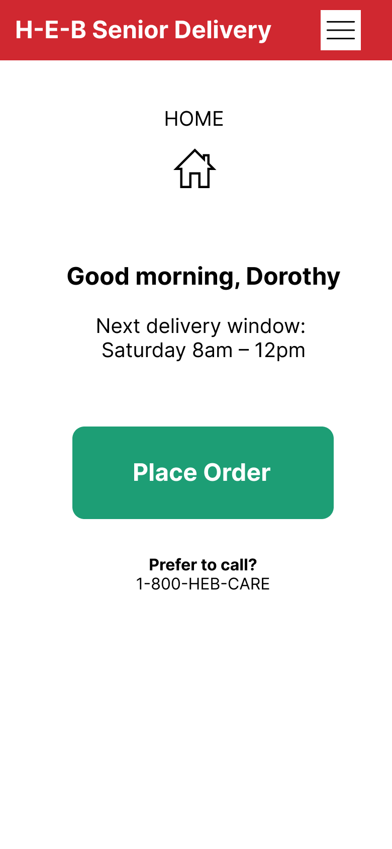
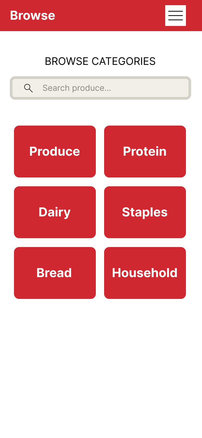
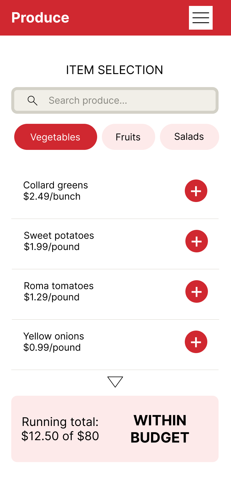
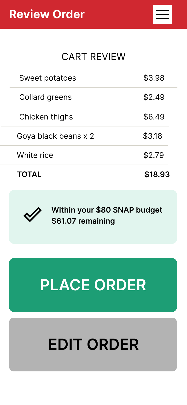
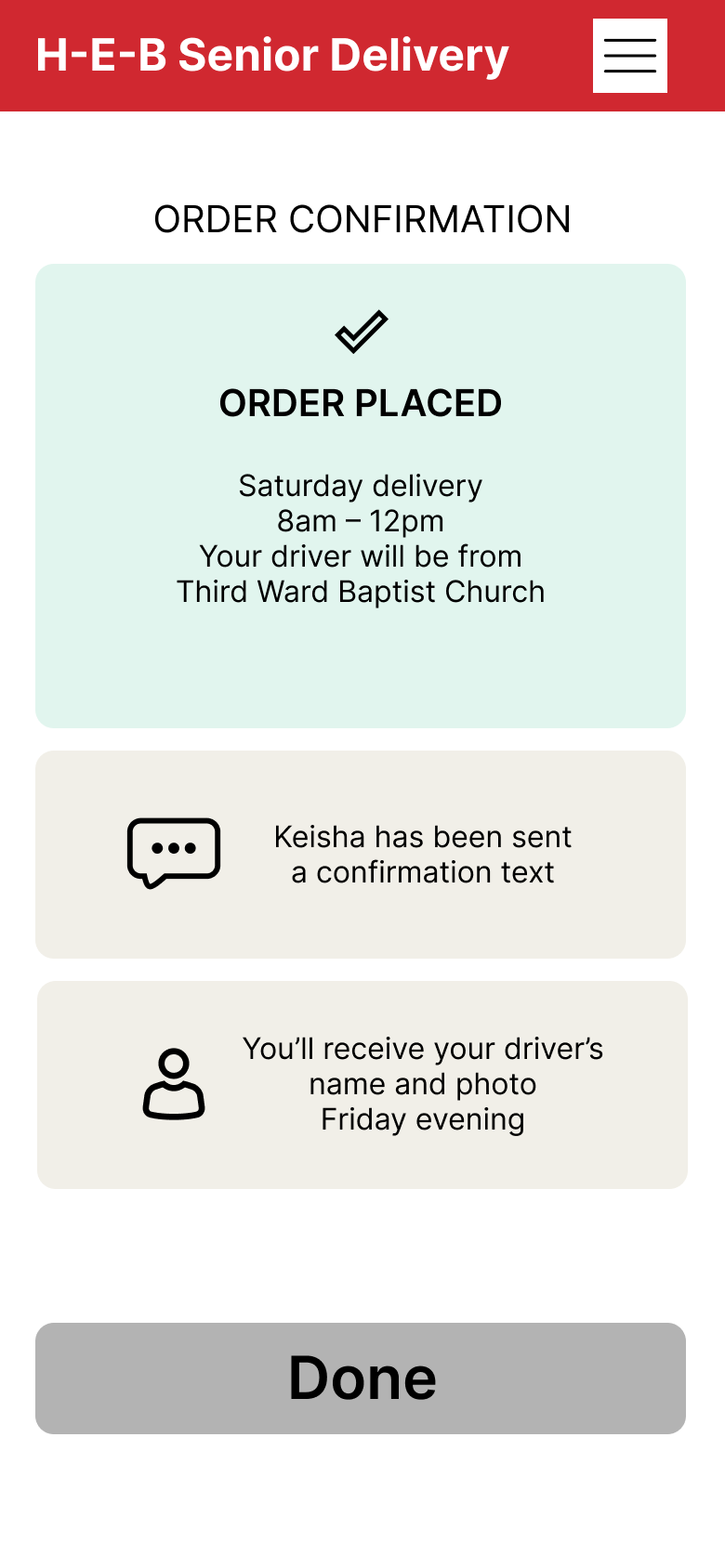
The wireframes focus on Dorothy's ordering flow — the five screens she moves through from opening the app to receiving her confirmation. Every design decision traces back to something specific: her arthritis, her budget anxiety, her old Android, her trust in the church, and Keisha waiting by her phone seventy miles away.
Key Design Decisions
For Dorothy:
Large tap targets throughout — designed for arthritic hands on an older Android device
Minimal typing required — browsing by category reduces the need for text input, with a search bar available for users who know exactly what they want
Running total persistent on every item selection screen — Dorothy never loses track of her spending against her SNAP budget
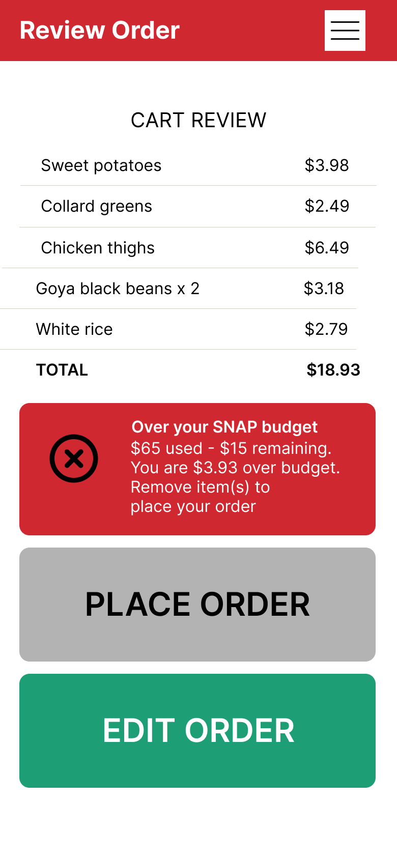
"Place order" button is greyed out rather than hidden when over budget — Dorothy knows the path forward exists, she just needs to resolve something first
Calm, friendly language throughout — no error messages, no jargon
For the system:
Program introduced through the church — the most trusted institution in the neighborhood, not a corporate app or government website
Driver's name and photo sent Friday evening — Dorothy knows who to expect before Saturday morning, removing a significant anxiety point
Phone order line visible on the home screen as an equal-status option — not buried or framed as a fallback
Keisha automatically notified at sign-up, order confirmation, and delivery completion — designed for two users simultaneously without adding steps for either one
Seniors without a Keisha need a separate support pathway — named as a design gap, not ignored
The Over-Budget State
One screen worth calling out specifically: the cart review when Dorothy has exceeded her SNAP budget. The most recently added item is highlighted in red with a suggested removal. The warning is calm and informational — exact overage amount, no alarming language. The "Place order" button is greyed out, not hidden. She knows what to do and how to fix it without feeling like she made a terrible mistake.
From Design Exercise to Real-World Program
This is a concept project, not a finished product. Moving it from a design exercise to an actual pilot program would require significant research, partnership-building, and operational groundwork. Here's what that next phase would need to address.
Understanding the Users
Conduct in-person interviews with Third Ward seniors to validate the assumptions made in this project — particularly around smartphone comfort, ordering confidence, and willingness to accept food assistance
Investigate stigma: does receiving food assistance feel uncomfortable for seniors in this community, and does program framing affect willingness to enroll?
Understand how many seniors lack a Keisha — a family member who can help with technology and enrollment — and design a separate support pathway for those who are truly on their own
Building Partnerships
Identify which Third Ward churches have active senior ministries and volunteer networks, and assess their appetite for partnership
Map existing senior food assistance programs in the neighborhood to identify gaps and avoid duplication
Determine whether H-E-B's existing Favor delivery infrastructure — technology, logistics, insurance — could support or accelerate the program
Operations and Funding
Clarify liability coverage for volunteer drivers — does H-E-B's commercial insurance extend to church volunteers during delivery windows?
Identify available funding: USDA food access grants, Texas Health and Human Services programs, City of Houston food insecurity initiatives, and H-E-B corporate social responsibility investment
Defining Success
Engage Third Ward seniors directly in defining what pilot success looks like — not just H-E-B and the church, but the people the program is designed to serve. A three-month pilot might measure number of households reached, repeat order rate, and a simple food security survey administered before and after. But the most important question — did this make a meaningful difference in people's lives — can only be answered by the people living it.
Reflections
This project taught me that designing for someone whose daily life looks nothing like your own requires more than empathy — it requires discipline. The discipline to keep checking your assumptions. The discipline to name what you don't know.
A few things that shaped my thinking:
The 14.8% statistic reframed the entire problem for me. I initially read it as evidence of how few people could overcome the barriers to getting food. But it also reads another way: 14.8% of residents are already making an exhausting trip that most of us would never think twice about. Dorothy isn't passive. She's doing everything she can.
Designing for accessibility and designing for dignity are not the same thing. Accessibility means the interface works for Dorothy's arthritic hands and old Android. Dignity means she doesn't feel like a charity case when she uses it. Both matter — and the second one requires real conversations with real people, which this project didn't include.
The Keisha insight changed the entire design. She emerged from thinking carefully about Dorothy's life — who else is affected, who else is involved, who else needs this to work. That's the part of UX thinking I find most interesting: the users you didn't know you had.
What I’d Test Next
If this concept moved toward a real pilot, here's where I'd start:
Can Dorothy complete an order without assistance? Usability testing with seniors on older Android devices — watching where they hesitate, backtrack, or give up. If Dorothy can't place an order on her own, nothing else matters.
Does the over-budget warning help or hurt? The greyed-out button and highlighted item suggestion are designed to reduce anxiety — but they're assumptions that need to be tested with people who actually experience budget pressure.
What brings DeShawn in? Volunteer recruitment messaging is a design problem too. Does "give back to your neighborhood" land better than "help a senior in need"? Testable — and critical to whether the program gets off the ground.
What does success look like at three months? Households reached, repeat order rate, and a simple food security survey before and after. The metric I'd watch most closely is repeat usage — if Dorothy orders again the following week, the design worked.
“Good design can’t solve systemic inequality — but it can make sure that when a solution exists, nobody is left out because the interface was too hard to use.”