
Knee Recovery Companion
A mobile app designed to support people through the hardest, most disorienting weeks of knee replacement recovery.
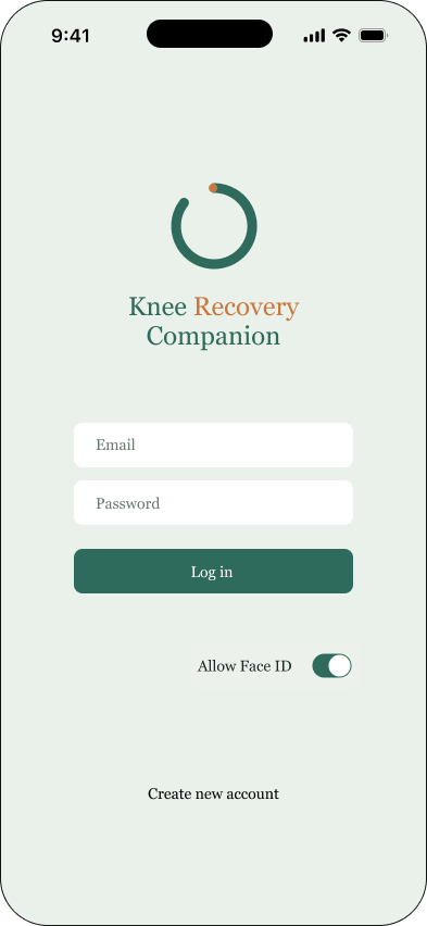
Click the title in the screen below to experience the prototype.
The ProblemKnee replacement is one of the most common orthopedic surgeries, and one of the least well-supported once the patient goes home. To understand what actually goes wrong during recovery, I read through dozens of real posts on Reddit and BoneSmart, a longstanding joint-replacement patient community, and found the same six frustrations surfacing again and again:
Sleep problems in the weeks after surgery
The mental and emotional toll being consistently underestimated
Feeling under-informed by doctors and surgeons
Physical therapy that feels inadequate or unclear
Persistent pain and dissatisfaction with the pace of recovery
Fear and uncertainty around basic mobility milestones
Underneath all six is the same set of needs: people recovering from knee replacement want to sleep better, feel calmer, be genuinely informed, and know they're making real progress, even on the days it doesn't feel that way.
The ApproachI designed Knee Recovery Companion around a single idea: reduce the cognitive and emotional load of recovery; don't add to it. Every decision in the app, from the number of menu items to the words used in a warning banner, was filtered through that goal.
The app is built around the surgery date as its anchor. Patients can set it up before surgery, while they still have the bandwidth to learn a new tool, so it's already familiar by the time they're recovering and have far less capacity to spare. Past or future surgery dates are both supported, since not everyone downloads the app in advance.
I also designed for a specific failure mode I saw in every competing product: people set an app up once and never open it again. So the content is built to reward return visits, not just onboarding, through daily tips, a milestone system, and a check-in that takes under two minutes.
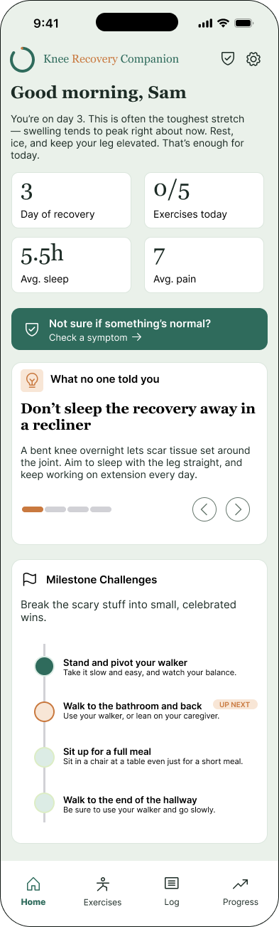
Information ArchitectureThe app has four bottom navigation items: Home, Exercises, Log, and Progress. A symptom checker and settings live as persistent icons in the top corner instead of competing for a fifth or sixth tab slot. That was a deliberate call: symptom-checking isn't a routine, scheduled action like logging your pain, it's something a patient needs the moment they're worried, regardless of which tab they happen to be on. Giving it a persistent, visually distinct entry point does more for a frightened patient at 2am than burying it as one tab among many.
Visual DesignThe interface is built on white as the primary surface, with cards, dark teal and light teal for structure and accent, and amber reserved specifically for things that need attention: high pain, low mood, symptoms worth watching. Red is used in exactly two places in the entire app: the log out action in Settings, and the most urgent tier of the symptom checker, where it means call 911 now. Orange marks the tier below that, where the guidance is to contact a physician.
Because color alone is unreliable for colorblind users, every color-coded status in the app is reinforced with text. A red badge doesn't just look red, it says "Emergency." An amber tag says "Call your care team." Nothing in the app depends on color perception to be understood.
The language throughout is calm and supportive rather than clinical. That tone was as deliberate a design decision as the color palette. Recovery is frightening enough without an app that sounds like a hospital form.
A symptom checker, built with real restraintEarly on, I considered a searchable symptom checker: the patient describes what they're feeling in their own words, and an AI responds, with a disclaimer that it isn't a doctor. I decided against it. The risk isn't hypothetical. If an AI-generated response ever reassured someone that a symptom didn't need attention, and that symptom turned out to be serious, the consequences would be severe, and unrecoverable in a way most product mistakes aren't.
Instead, the symptom checker offers a fixed set of common post-surgical symptoms, each with pre-written, consistent guidance across three tiers: usually normal, call your care team, or seek emergency care. The goal was an app that helps a worried patient act quickly and correctly, not one that improvises in a moment where being wrong matters most.
The PrototypeThe prototype is a working, mostly-interactive click-through. From the login screen, click Create new account to go through the full setup flow, including the surgery date, procedure details, an instructions upload step, and a short app walkthrough. Clicking Log in instead drops you straight into the Home screen.
Most of the app is clickable, including the tips on the Home and Daily Log screens. A few secondary elements are static for now: toggle switches, the items under "More to log," and most of the Settings screen.
Competitive LandscapeTwo existing products sit in the same space. mymobility, from Zimmer Biomet, ties patients to a specific implant manufacturer and is built around clinician-facing metrics like gait speed rather than patient-facing reassurance, so it's a limited competitor in practice. MoveAgain: Recovery Tracker is the real one: a patient-owned, privacy-first recovery app with genuine overlap in both audience and philosophy. Designing against a real, live competitor rather than a hypothetical one sharpened the differentiation in this project considerably.
Where MoveAgain focuses on clinical tracking and CBT-based coping content, Knee Recovery Companion leans into milestone-based motivation — breaking recovery into small, sequential, concretely defined wins rather than open-ended logging. It also takes a more conservative approach to AI: rather than a generative symptom checker, it matches user input to fixed, pre-reviewed guidance, prioritizing safety over flexibility.
Next StepsThe next phase is user feedback, focused on three questions: is the content genuinely useful, is the app easy to use day to day, and, just as importantly, how does using it make people feel. For an app built specifically to reduce fear and cognitive load during a hard recovery, that last question matters as much as any usability metric.