UX Design is Everywhere
Don Norman opens The Design of Everyday Things with what might be the most universal example of bad design there is: doors. He admits to regularly pulling doors meant to be pushed, and pushing doors meant to be pulled. "Amazing," I thought when I first read it. It happens far more often than it should.
My mom lives in a condo building where the glass entry doors have identical vertical handles on both sides. To me, a vertical handle reads as "pull me" — why else would you put a handle there? But on these doors, you pull one side and push the other. Same handle, opposite instructions, no way to tell which is which until you've already guessed wrong.
I suspect this is just how these handle kits are sold: two matching pull handles, regardless of which way the door actually swings. If a door opens in one direction and closes in the other, it should ship with one pull handle and one push plate. Then the body knows what to do before the brain has to think about it.
It reminds me of an old Gary Larson Far Side cartoon: a door leading into "Midvale School for the Gifted," fitted with a pull handle and a sign that says "Pull" — and a kid pushing on it anyway. The design is about as clear as design gets. The joke is that clarity alone doesn't save you from habit, distraction, or a bad assumption. Even "gifted" kids get it wrong.
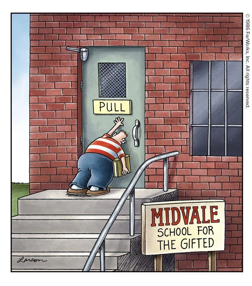
Copyright Gary Larson
We tend to file UX design under apps and websites and leave it there. But it's everywhere something exists for a human to use — and here's the tell: unless you're trained to look for it, you rarely notice good design. Bad design is the only kind that announces itself.
A crosswalk that assumes you can walk through grass
There's an intersection near me in Houston where one corner makes the point plainly. The sidewalk ends short of the corner, but the crosswalk button doesn't — it's still planted back in the grass, well past where the pavement stops. For someone able-bodied, it's a minor annoyance: a few steps off the paved path to press a button. But every time I make that little detour, I think about who this actually excludes — someone using a wheelchair or a walker, someone with low vision, an elderly person unsteady on uneven ground. For them, this isn't a shortcut off the path. It's a barrier.
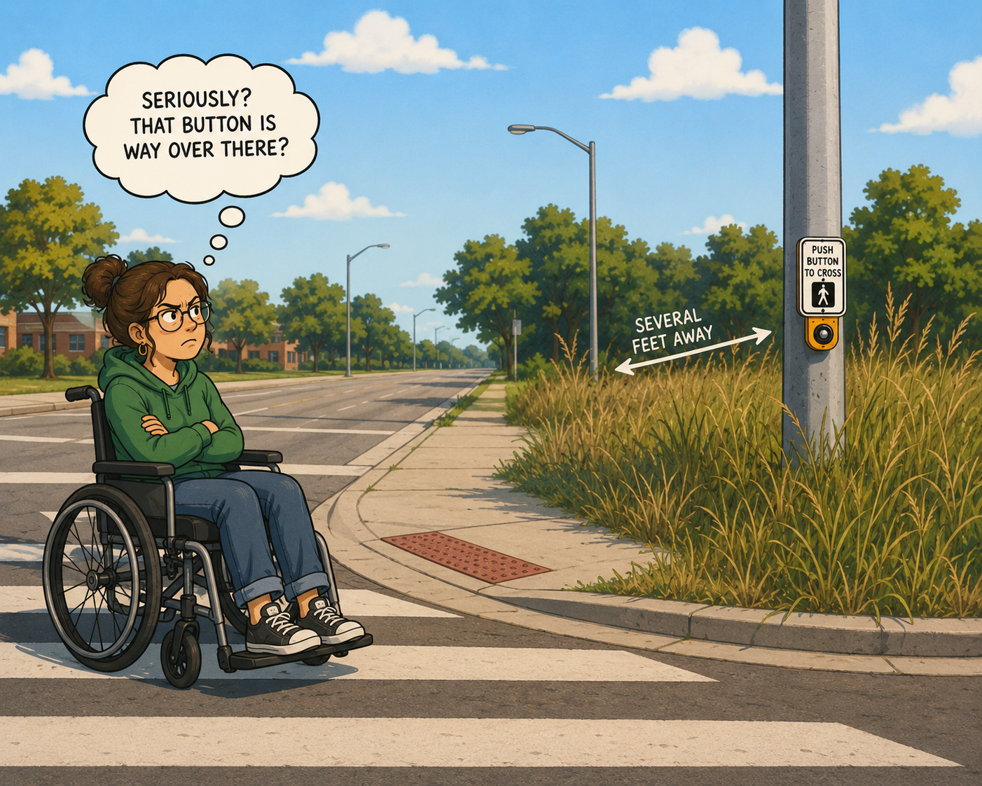
Image created by ChatGPT
Houston isn't a famously walkable city to begin with, but that's exactly why the walkable moments we do have should work for everyone. Relocating the pole itself may not be practical. Extending the sidewalk those few extra feet would be.
A faucet that makes you audition for water
Public restrooms have their own entry in the bad-design hall of fame: the automatic sink. You approach, and nothing happens. You wave a hand under the spout — nothing. You try the side, then further under, then pull your hand back and try again, faster, as if speed were the missing variable. Eventually water appears, but you couldn't tell anyone what you did differently to make it happen. There's no handle, no label, no feedback to tell you where the sensor actually is or whether it's even working. The design gives you no model of how it functions, so you're left guessing at a machine instead of using it.
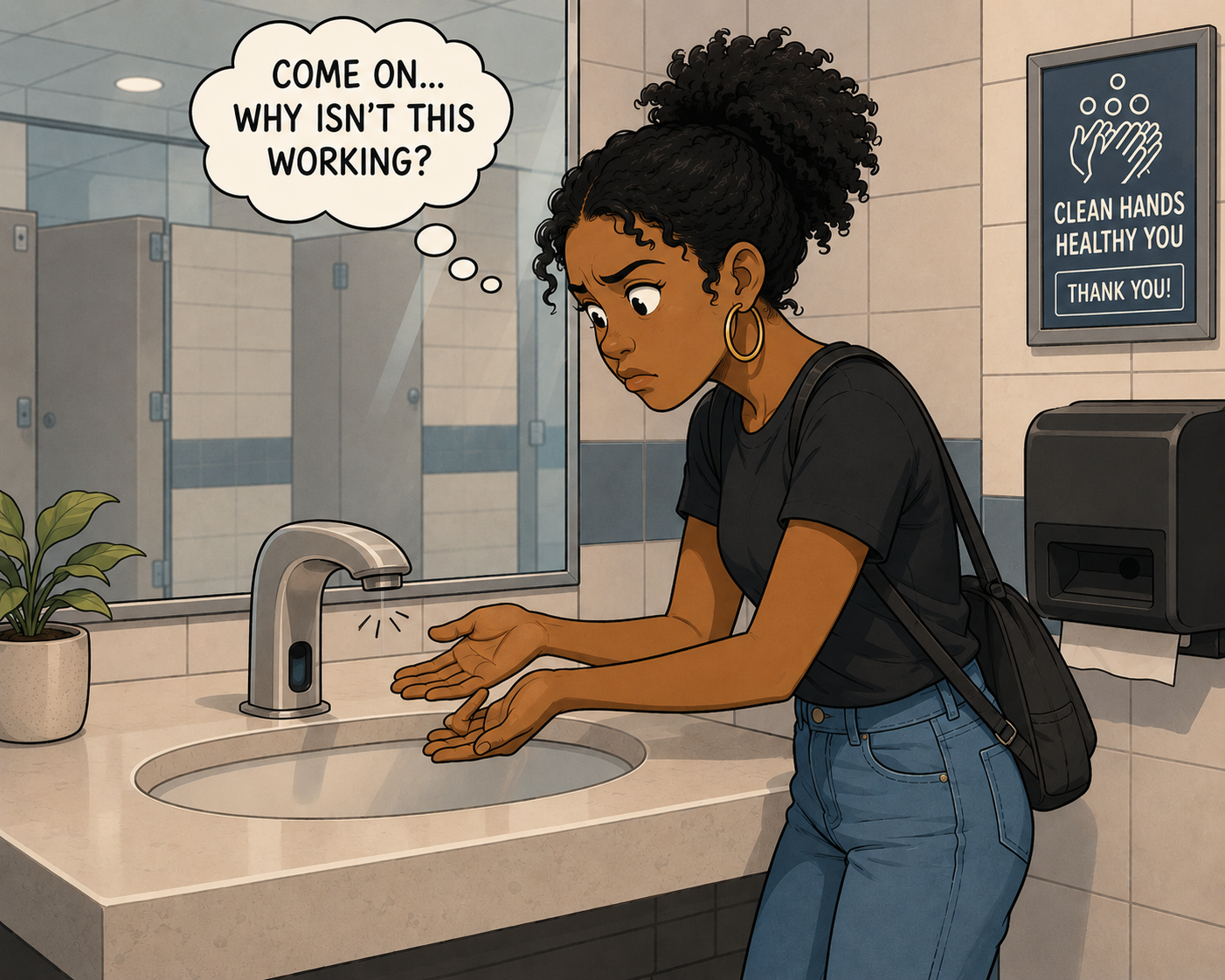
Image create by ChatGPT
This is a small, low-stakes example — nobody's stuck outside a building because of it — but that's what makes it useful. It shows that bad UX isn't reserved for high-stakes systems. It shows up anywhere a product fails to tell you, clearly, what it wants you to do.
Noticing is the whole skill
Doors, crosswalks, faucets — none of these were designed by people trying to make life harder. They're the result of decisions made without enough thought given to the person on the other end of the interaction: which way the door swings, who's actually navigating that corner, what feedback a sensor owes the person standing in front of it.
That's the real throughline of UX design, whether it's a condo door or a mobile app: good design disappears into use, and bad design forces the user to stop and figure out what the thing wants from them. Once you start noticing it in the physical world — the doors, the sidewalks, the faucets — it gets a lot harder to unsee it in the digital one. Which, honestly, is exactly the habit of mind the work requires.