The Answer They’re Begging For
People want a verdict from health apps. The responsible ones often can't give one — so what do you hand someone instead?
It's eleven at night and you've found a spot on your shoulder you don't remember. The first dermatologist who can see you is months out, and you don't have one anyway. Almost nobody does until they need one. So you open your phone, upload a photo, and wait for the thing you actually came for: an answer. Benign or not. Fine or not fine. A verdict you can go to sleep on.
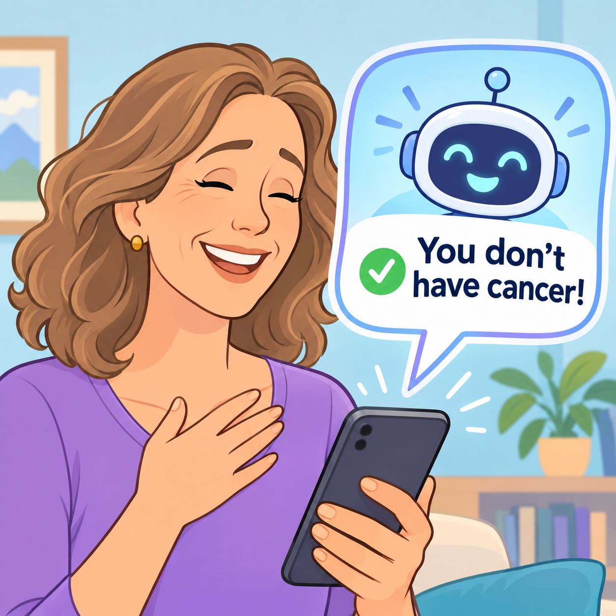
Image generated by ChatGPT
That wanting is the whole story, and it's worth sitting with before we talk about anything an app does. People don't come to a health tool for data. They come for interpretation — for someone, or something, to look at the ambiguous thing and tell them what it means. "Your recovery is right on track." "This looks like nothing." "You're about to get a migraine." The relief they're chasing isn't information. It's certainty.
Here's the problem: the responsible tool often can't hand that over. Not yet, anyway. A photo can't safely rule out a melanoma. A pattern in your data can't safely promise you the good outcome. And a tool that says "this is nothing" and is wrong has done something even a mistaken clinician usually gets to catch later. It has sent someone home reassured, at eleven at night, alone.
So the design question that actually matters isn't the one everybody reaches for. It's not "how do we word the disclaimer." People believe what they interact with, not what the fine print tells them — the confident interface, the number, the clean result. The footer isn't where the belief lives, so it isn't where the safety lives either. The real question is harder: what do you give someone instead of the certainty they came for?
I got interested in this from the marketing side, where I spent twenty years before turning toward health UX. Marketing knows exactly what to do with a person who wants certainty: give them the feeling of it. Take a claim that ought to carry serious constraints — "detects your risk," an accuracy figure to two decimal places — style it confidently, tuck the caveats into gray text, and let the interface imply the verdict the words are careful never to promise. I've watched that move my whole career. It works because it's answering real demand. The person wanted to be told. The copy told them.
I don't think that makes marketers villains, and I want to be careful, because the lazy version of this essay is "marketing bad," and that’s wrong. The overselling is tempting precisely because it's handing people something they're genuinely begging for. That's what makes this a hard problem instead of a morality play. But wanting a thing doesn't make it safe to receive. And, in health, the gap between what people want to be told and what can honestly be said is exactly where someone gets hurt.
So, say you take that seriously and try to design for it honestly. Here's why it's genuinely hard — every obvious option costs something.
Give the verdict anyway. You say "you're fine," or "this is serious," and sometimes you're wrong. The dangerous error isn't the false alarm; it's the false reassurance — the person who had the real thing and went back to bed. That's the one that ends the worst.
Withhold, and hand over the raw data. "Here are your numbers. Here's what we observed." Safe from a liability angle — and also the exact thing people are most frustrated by. I keep seeing that complaint about health and wellness apps. “It won't just tell me what this means.” Dumping the interpretation back onto the most anxious person in the room isn't caution. It's abdication wearing caution's clothes.
Send everyone to a doctor, to be safe. Feels responsible. But reflexive escalation isn't a free safe default. It manufactures a different harm: the anxiety, the cost, the crowded clinic, and eventually the overdiagnosis and overtreatment of things that were never going to hurt anyone. "Go get it checked" is right for a lethal-but-treatable maybe. As a reflex for everything, it just relocates the damage.
None of the three easy doors is the answer, which is why I don't have a tidy one to give you. But you can see the shape of where a better answer would live. Not a verdict. Not a data dump. Not a reflexive "see a doctor." Something more like honest interpretation: here's what this looks like, here's how sure I am, here's the one thing actually worth doing about it. Interpretation that takes real weight off the person without faking a confidence the tool hasn't earned — that reduces the load without inventing the answer. I don't think anyone has fully cracked what that looks like on a screen. Which is exactly why I think it's the design problem worth our attention.
Let me put my own work on the table, because it's too easy to pose this from the sidelines. One of my projects, Droma™, tracks the early signs of a migraine. Right now it does something deliberately modest: it surfaces the patterns — the signals that tended to show up before your past migraines — without ever declaring "you're getting a migraine." For a long time I filed that under limitation. Lately I suspect it might be the most honest thing it does. It interprets without pronouncing.
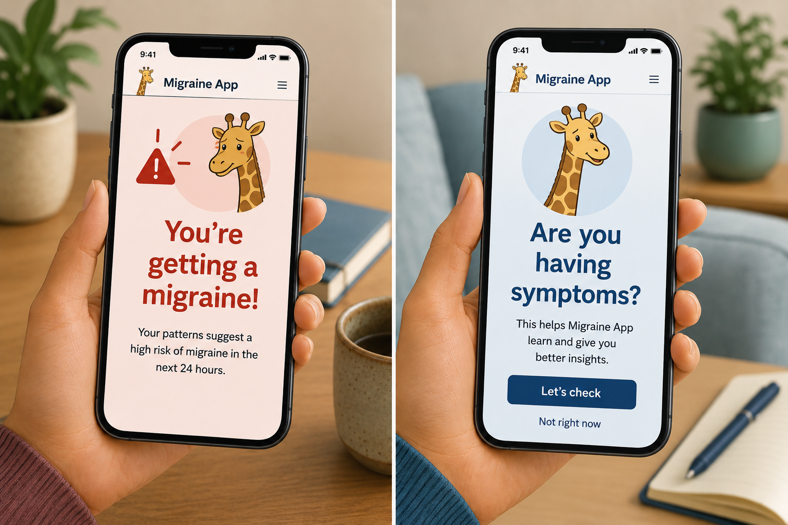
ChatGPT-generated image of a fictional migraine app
But here's what I genuinely go back and forth on, and I'd love people to think about it with me: modest might be too modest. Surfacing signs and leaving you to connect them yourself edges back toward the data-dump problem; “I've handed you the pieces and made you do the frightening math at eleven at night.” How far could it move toward "this matches the pattern that preceded your last three migraines" — real interpretation, real weight lifted — before it tips into manufacturing a certainty it doesn't have? I don't know where that line is. I hit the same wall in a recovery tracker (when is "you're healing well" honest reassurance, and when is it a promise you can't keep?) and anywhere near mental health, where "you may be heading toward hypomania" could be a gift or a landmine depending entirely on how sure you let it sound.
I'm new enough to health UX that I'm doing more asking than answering here. And, for this particular problem, I think that's the honest posture, because I don't believe it's solved. The desire for certainty isn't going anywhere. If anything, AI is about to make faking it cheaper, smoother, and more tempting than it has ever been. Which drops the question right in front of anyone building these things: when someone comes to your product wanting an answer you can't safely give, what do you put in their hands instead?
I have partial answers and a lot of unfinished thinking. What I don't have is the answer. If you design in this space — or you've just been the person at eleven at night — I'd genuinely like to know how you'd draw that line.