UX Design: Systems, Not Screens
The app is usually the “easy” part.
Good UX design puts the user front and center — that's the whole point of the discipline. But even with the user held front and center, it's easy for the actual deliverable to become the focus: the flow, the layout, the interaction. In my own work, the screens have never been where a project actually succeeds or fails. What determines that is the system around the screens — who has to agree to something, who has to change how they work, what has to sync with what, before the interface even matters. The user can be entirely at the center of your thinking and the project can still die in the system surrounding them.
Example 1: a grocery app nobody had to use
For my Third Ward zero-hunger concept, I designed an app that would let seniors order groceries from their neighborhood H-E-B and have them delivered free through a local church. The app itself — order, confirm, done — was straightforward. It was never the hard part.
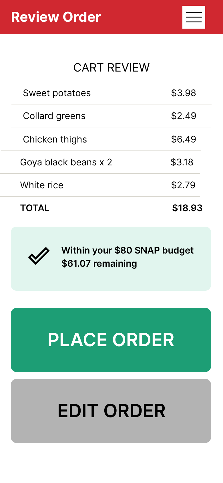
Review order screen from grocery delivery app prototype
The hard part was everything the app depended on outside itself: H-E-B agreeing to batch weekly orders and deliver them for free, a church agreeing to serve as the drop-off hub, and volunteers agreeing to show up every week to carry groceries the last mile. A perfectly designed ordering screen means nothing if none of those agreements exist. The system had to work before the interface could matter at all.
Example 2: a system with five stakeholders and no shared record
Cariva™, my caregiver platform, is a harder version of the same problem — not "who has to agree to participate," but "how do you get a system to actually reflect reality for five different stakeholders at once." A single care situation typically involves the patient, one or more caregivers, doctors, home health aides, and whatever institutional system the doctor's office runs on — usually Epic, on the backend.
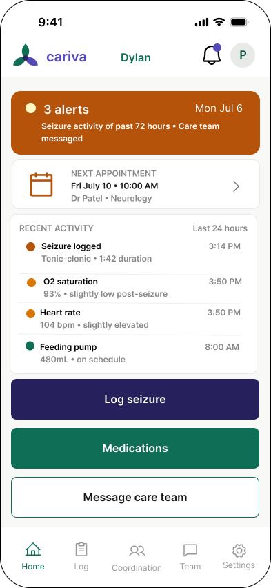
Cariva™ home screen
Designing for that meant thinking in FHIR and EHR interoperability before I could think about a single screen. Can a caregiver's update actually sync with what a doctor sees in Epic? Does a home health aide's visit note make it back to the family, and does the family's observation make it back to the care team? If those data paths don't exist or don't sync cleanly, the app becomes just another disconnected log — one more place caregivers write things down that nobody else ever sees. The screen can be flawless and the product can still fail, because the failure lives in the data architecture and institutional plumbing underneath it, not in the interface sitting on top.
The pattern underneath both
In both cases, what looked like "design the app" was actually "design the agreements, incentives, and data flow between real people and institutions" — and the app was just the visible tip of that. This isn't unique to healthcare or nonprofit work. It shows up anywhere a product needs more than one party to hold up their end for it to function at all.
It's also worth saying plainly: sometimes the screen genuinely is the hard part. Plenty of good products fail on interaction design alone, and system-level thinking isn't a substitute for getting the interface right. But it is very often the thing that gets skipped, because it's less visible, less fun to prototype, and doesn't show up in a portfolio screenshot the way a clean UI does.
What this changes about how I work
I've started every project since the Third Ward concept by mapping who has to agree to what before I open Figma — which parties are involved, what has to sync or hand off between them, and where the whole thing breaks if one party doesn't participate. With Cariva™, that meant understanding FHIR and EHR data flow before I understood what the home screen should look like. The interface comes after that map is drawn, not before — because no amount of polish on a screen fixes a system that was never going to work underneath it.